When, Where, and How to Use Color
by Haus of Blaylock
Designing a room can be stressful, especially when selecting the color scheme. It’s my job to manipulate color to suit my client’s needs for any given area. Many factors go into planning a color scheme, but today I’ll give you some of my tips and tricks when it comes to all things color!
60-30-10 Rule
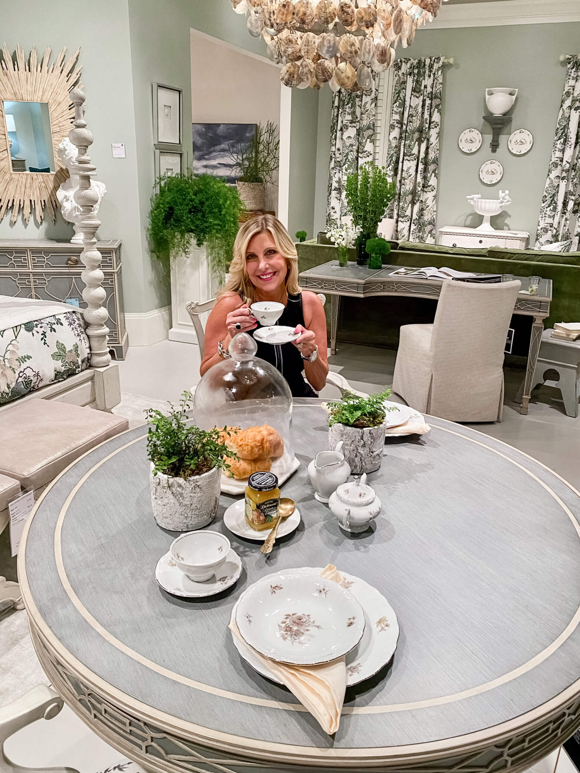
The 60-30-10 rule is a great rule to follow when selecting colors for a particular room and where to place them. Each number represents the total percentage of space the color should take up in a room. The first shade you select will be the dominant shade in your overall design. You want this shade to be either a neutral or subdued color because it will be taking up a lot of space and you don’t want it to be too overwhelming. You’ll most likely use this color on your walls. The second shade you select will be a bit bolder and will take up 30% of the space. This color is often used for sofas, chairs, cabinetry, side tables, rugs, etc. The third shade will be your accent shade, meaning it will be the boldest color of the three and will take up 10% of the remaining space. This color is often seen in pillows, art, floral/plants, etc.
Warm vs. Cool
The next thing you should know is when to use warm and cool colors. Red, orange, and yellow are considered warm-vibrant colors, while warm-neutral colors are beige, cream, and gray. Remember that the color in the room reflects the atmosphere you’re striving to accomplish for the space. Vibrant colors work best in lively rooms (i.e., rooms for entertaining) because you want the room’s atmosphere just as vibrant as the color you’re using. Cool colors are considered more subdued (blue, green, purple, grey) and are best for rooms you wish to have a calming energy, such as the office or bedroom.
Color Schemes
There are numerous types of color schemes, but the ones we’re focusing on today are complementary, analogous, and monochromatic. Complementary color schemes use two shades of color and are found opposite of each other on the color wheel (blue and orange, yellow and purple, red and green). These colors are usually high in contrast, meaning they bring a lot of energy to a space, so it’s best to use them in small doses, i.e., for accent pieces (10%), and use neutrals to balance them out.
For an analogous color scheme, you’ll want to choose a central color. Then, select the colors on either side of that color on the color wheel. You should end up with two primary colors and a third color which will be a mix of the two (red, orange, yellow or red, purple, blue). For this sort of color scheme, proportion is extremely important so you’ll want to use the 60-30-10 rule. You can also add a visual variety by using the same color in different shades.
I recommend using the monochromatic color scheme for those who prefer more neutral colors, focusing on a single hue’s shade, tone, and tint. Tints occur by adding white to the hue, while shades and tints occur by adding either a darker color, grey, or black. Monochromatic color schemes provide stronger visual cohesion while simultaneously allowing for a greater range of contrasting tones, making it one of my favorite color schemes!
Current Trends
Style trends are constantly changing and evolving. They come and go but always come back with an added twist. That twist may be the use of different forms or materials, but you can always guarantee there will be a difference in the colors used.
Are you interested in diving into the different design styles and movements of the 20th century? You’d be surprised at the impact they’ve had and will continue to have, so check back soon!
